ScanClinic
- Opus Web Design

- Jul 31, 2023
- 1 min read
Updated: Oct 29, 2024
Building Trust and Care:
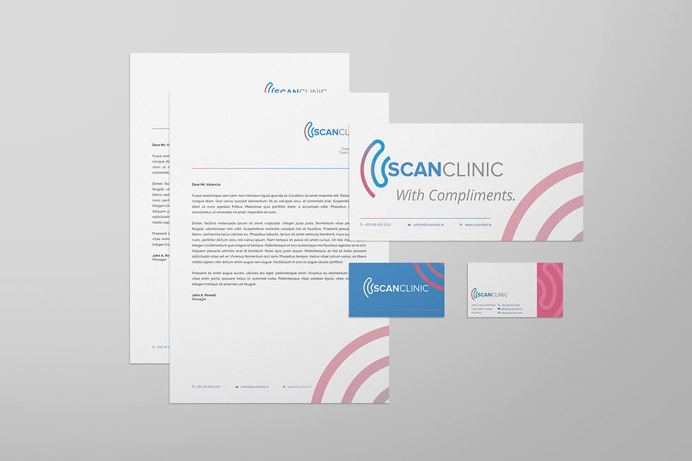
ScanClinic has refreshed its brand identity to mirror its blend of professionalism and compassion in healthcare. This update includes a soothing color scheme with tranquil blue for trust and gentle pink for warmth, symbolizing their patient care focus.

A Cohesive Brand, A Positive Experience
Their visual assets, from modern medical imagery to clear, confident fonts, and patient communication materials like business cards and letterheads, all reinforce ScanClinic's dedication to advanced, patient-centered care, ensuring a consistent and professional brand image that builds patient trust and showcases their commitment to exceptional healthcare.
From the smallest graphic asset to formal communications, consistency is key. ScanClinic's brand kit ensures a unified and professional image across all touchpoints, fostering trust and confidence among patients while reflecting their commitment to delivering exceptional healthcare services.


